
There’s a strong bond between user experience and technology. As tech advancements increase by the minute, users look forward to better digital experiences in every technical aspect. Right from the internet speed, to the size of the digital screen, to the type of font used. Yes, even the font matters.
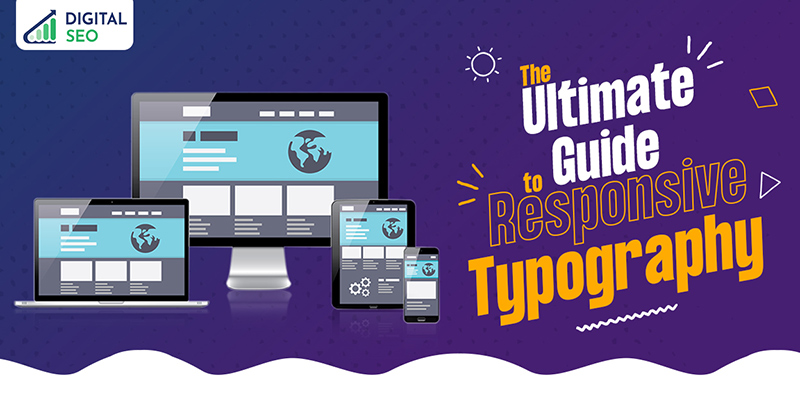
More importantly, having a responsive web design is a top priority for most WordPress web design companies, since users use multiple devices with different screen sizes. A responsive website will have images and content scaled to fit any screen size, navigation pattern and adapt seamlessly to the device’s capabilities. Therefore, even typography must embrace responsive design to make content legible and appealing on any device.
What Is Web Typography & Why Is It So Important?
You are greeted by words, letters, numbers, and punctuation marks when you open a website. These words and letters are represented in particular styles, sizes, slopes and typefaces to make up a readable, displayable set of characters. A font is a combination of these characters, and Web Typography is the process of using different fonts on a website.
Web Typography is more of an art than a technical process. It calls for a certain degree of creativity to decide on the font type and design and arrange paragraphs on a web page. Good typography has the power to grab the reader’s attention and create a connection with the content and images. For the web designer, typography is effective visual punctuation, graphic accents, and visual hierarchy- three elements that make a stunning website design.
The aspects of good typography:
Note that we mention the adjective “good” with typography because, in the age of Responsive Web Design (RWD), that is just what we need. Good typography goes beyond the act of choosing beautiful fonts. It is a vital interface design component comprising the following abilities:
- Sets the overall tone with good visual hierarchy
- Provides graphic balance to the website
- Influences decision-making and brand recognition
- Guides and informs users
- Keeps readers attentive to the content
- Optimises readability and accessibility
- Enhances user experience.
So, if it is so important, what goes into creating Responsive Web Typography? More than half a dozen elements work to conjure up typography that exudes personality and character. These elements are critical in making the typography web-worthy, and can express ideas, moods, and meanings. Let’s check them out.
8 Key Elements That Create Responsive Web Typography
1. Typeface
Selecting a typeface for a responsive design is the first step. As a rule of thumb, there shouldn’t be more than three typefaces, though a maximum of two is probably best. Look for popular typefaces. Open Sans, a sans-serif typeface, appears to be the trend of the moment. Serif typefaces may be suitable for headings, while sans-serif typefaces are better for body copy. If you are interested in perusing fonts, check out these two great web font libraries- Google Fonts and Font Squirrel.
2. Hierarchy
Typographic hierarchy is a systematic way of organising typefaces to establish an order of importance within the content. It helps to guide the reader’s eye to the most prominent content that should be noticed first, next and so on. Hierarchy is vital in helping the reader navigate through the page’s contents without missing out on the most vital pieces of information. For example, headings are always larger than sub-headings and standard text. There are four factors in creating a good hierarchy:
- Size
- Colour
- Alignment
- Contrast
3. Colour
Users love colourful websites, but choosing the right one amongst a thousand colours requires a trained eye. This is where web designers can unleash their creativity and elevate the interface to a whole new level. However, a word of caution. Choosing the text colour requires finesse. It should be accentuated the right way to convey the message in the right tone. Get it wrong, and it can result in a messy, chaotic jumble of colours.
4. Contrast
In typography, contrast means that no two elements are the same, right from the colour, font size, weight, scale, and spacing. However, the contrast should be harmonious to create an aesthetic balance and make the page interesting and meaningful. To create attention-grabbing contrasts, you can try various colours, fonts, font sizes, and styles and break up the page with an interesting twist.
5. Consistency
Consistency is largely related to the typefaces used on a webpage. If hierarchy is important, consistency highlights it and conveys the information the way it was intended. Establish consistency by sticking to the same font styles to create a noticeable, readable pattern. A winning formula for consistency is to use one font for headings, another for subheadings and stick to it.
6. Text Readability
Web content reading is not like book reading. Visitors usually skim through the page to get the gist of the content rather than reading it word-by-word. It is for this reason that text readability and its components are given ample importance. There are four components to text readability:
- Letter spacing
Also known as tracking, it refers to the horizontal white space between the letters in a sentence or paragraph. Spacing affects the visual density of a page. Closely-spaced words appear more compact, whereas widely spaced words render an airy appearance. The trick is to maintain a correct space between words to enhance the text readability.
- Line spacing
Line spacing refers to the vertical space between two lines in a text. It holds the same significance in determining text readability by making it easy for the reader to skim from one line to the next.
- Line length
Line length is defined by the number of characters on each line rather than the number of words. The ideal line length is 45-85 characters per line. Anything longer or shorter will affect the readability. Lengthy lines will impact the reader’s focus, and very short ones will break the reading rhythm.
- Text alignment
How have you aligned your webpage content? Is it aligned left, right, on in the centre? Text alignment is a design choice that requires a careful thought process because it impacts your page hierarchy and text readability. Good alignment draws the readers eye to the content and keeps them anchored as they know where each line starts and ends.
Responsive Typography: Delivering Your Content With Maximum Impact
How you deliver your content determines the success of your website, and thereby your business. Your site’s responsive typography should play a subtle but impactful role in conveying your business aspects.
At DS Web Design, Tirunelveli, we are a leading web design and development company you can rely on for excellent web design services and solutions. We are staffed with seasoned web designers who can enhance your website in the best possible ways. Having collaborated with dozens of clients, we offer an unmatched level of experience in web design. Get in touch with our team to explore the possibilities.
Latest posts by Digitalseo Team (see all)
- Landing Pages for Mobile – An Optimization Guide - March 18, 2024
- Maximizing Core Web Vitals with Effective Image Optimization Techniques - March 1, 2024
- Secure Your WordPress Site: Vital Security Enhancement Tactics - January 3, 2024