
Did you know that fonts are indispensable in designing a responsive website?
Of course, many aspects go into creating a responsive website, but font size plays an equally important role. Let’s go ahead and discuss these points in greater detail.
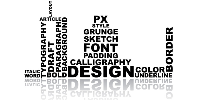
Typography and Website Responsiveness: What’s the Connection?
Font size enhances readability. As simple as that sounds, font size or typography can make or break a website. Font size creates hierarchy, one of the main aspects of any website. Here’s a better explanation: Let’s say your client logs in to your website. What they want is to be greeted with an attention-grabbing headline followed by clear, readable text.
The text hierarchy is a crucial element that allows the reader to understand the order of importance of the information on the webpage. A typical text hierarchy denotes the main title or H1 in the biggest font size. Subheadings H2 and H3 are smaller than H1 but more defined than the body of the content.
Why Is Typography Important?
Website visitors have an eye for detail. Whether it is overall design, layout, colour, images, or font, nothing goes unnoticed. Besides, it is a human tendency to be attracted to the font size that makes the content readable. Moreover, the right font size can create a contrast and enable users to focus on the key message on the page.
As mobile responsiveness becomes necessary for websites, fonts play a critical role in enhancing the site’s responsiveness on various browsers and devices like laptops, mobile phones, smartwatches, and smart TVs.
Here’s the big challenge: There’s no standard size for fonts. There are more than a dozen sizes, making the job all the more demanding. We’ve compiled a list of guidelines to simplify the process of choosing the right font.
How to Choose the Best Typography for Your Mobile & Desktop Website
Let’s first deal with mobile web typography since most of your viewers will access your website from their mobile phones. You need to consider the following:
1. The body font size of the website
It is important that people can easily read the body of the website to understand what we are trying to convey. Choosing a default font size for mobile devices is usually best accomplished with 16pixels. Why? Because it is the same font size displayed by most browsers and even in printed books.
Another reason is that people typically sit 50 to 58 cm from their screen (although 71cm is the recommended distance). Your text should be easy to read without straining their eyes.
However, the downside to using 16 pixels is that it cannot be used for all font types. Some typefaces match perfectly with 16 pixels, but other fonts may seem too unintelligible to read. Use 16 px if the size fits your body text and is easy to read, but if it is not, adjust it or consider using another one.
2. Font size for input text
Are your viewers zooming in to read the input text? Big mistake. The text input size should be big enough to read even from smartphones. The rule of thumb with input text is to use 16 pixels.
3. Font size for secondary text
The font size for secondary texts like captions and labels should be two times smaller than the size used for your paragraph texts. This difference in size enables users to distinguish between both contents. You can also highlight or style certain texts for better communication. For example, using a light shade of colour will draw the user’s attention to that particular text.
4. Use of an actual device to test font size
For better responsiveness, the rule of thumb in choosing mobile font sizes is to use an actual device like a phone, laptop, tablet, or desktop. Using gadgets with various screen sizes will allow you to ascertain the font size match and make alterations if necessary.
5. Material design & standards
It is always best to keep an eye on the latest design systems for material designs and iOS standards because
- The default font size for iOS is 7 pixels SF Pro, and the secondary font size is 15 pixels.
- Material Design’s default font size is 16pixels Roboto, and its secondary font size is 14pixels.
Let’s deal with desktop web typography, which is of two types:
1. Text-heavy pages
Take a look at any website. The pages with the heaviest content are those with articles, news, and blogs. In such pages, the primary goal is to provide the user with an engaging reading experience; the interaction is the secondary objective. Therefore, such pages require a larger font size to make the content readable for all users.
2. Interaction-heavy pages
Interactive pages require more clicking, browsing, hovering, typing, editing, and searching. Yes, there will be plenty of text on the page, but your users will not read it like they would read a blog or an article.
The ideal font size for interaction-heavy pages would be 13 pixels for the more important texts and a smaller size for the less important ones. You can also highlight the 13 pixels’ of text to accentuate it on the page.
Using the Right Font Size For the Right Text: A Quick Guideline
UI designers often mistake using too many font sizes due to the vast number of options available. Let’s not forget that even with font sizes, less is more. Rather than overwhelming the user with fonts of many sizes, it would be wise to use no more than four sizes.
Here’s a quick guideline to use for reference when you are caught in a “font-size” dilemma:
- Use the biggest font size for titles and headlines.
- Use the default font size for all body texts, such as dropdowns, buttons, menus, text boxes, and other controls.
- Use a font size that is 2pt smaller than the default font size for all secondary texts that convey less-important details on your site.
- Choose a tertiary or “wildcard” font size for labels and captions, just in case you need an extra one.
A Responsive Site Needs Great Fonts!
Don’t take your fonts for granted! Fonts increase readability and hierarchy and play a vital role in making your website look appealing and aesthetic to the user.
Want some professional guidance to pick the right font size for your website? Leave it to the web designers at Digital SEO, the best web development company in Chennai. Would you like to discuss your web design requirements with us? Call us today!
Latest posts by Digitalseo Team (see all)
- Landing Pages for Mobile – An Optimization Guide - March 18, 2024
- Maximizing Core Web Vitals with Effective Image Optimization Techniques - March 1, 2024
- Secure Your WordPress Site: Vital Security Enhancement Tactics - January 3, 2024