
Unlike a brand’s website, which serves various users and purposes, landing pages are designed to draw in the right leads and filter out those who aren’t interested. They’re a powerhouse in turning potential customers into real leads by offering a single, compelling offer. If you have similar goals, our experts at Digital SEO- a leading web design company in Chennai, can create top-notch landing pages for your business.
Also, if you want to boost the effectiveness of your online advertising, adding landing pages to your website is a must. So, knowing what constitutes a successful landing page can help you engage your audiences even more.
A landing page is a stand-alone web page created specifically to attract potential customers in response to an enticing advertisement. It can also be called a splash page, static page, squeeze page, or after-click page. When a user clicks on an advertisement, email link, or social media post, they are taken to the landing page. If you want to make it easier for people to access all the essential information, you can also develop a specific landing page for each event.
The Top Web Design Company in Chennai Explains the Anatomy of Landing Pages
There are some key differences between building a standard website and developing a landing page. Some components should be included in the design of your landing page if you want to maintain high user engagement, decrease page abandonment, and increase conversions.
The essential components of a landing page and their respective optimisation strategies are outlined below.
Differentiating Factors (USP)
A USP is the enticing feature of a product or service that makes it stand out from the crowd. It provides the answer to the question- why is this deal so exceptional? But, ensure that the concept of “uniqueness” does not distract you. Your Unique Selling Proposition (USP) is how your product or service stands out from the competition. This proposition must be conveyed clearly on landing pages so that readers can quickly grasp what makes your product or service unique. Several website elements work together to explain what makes your product special:
1. Main Headline
Your headline is your first chance to make an impression. It’s crucial that it captures your visitor’s attention and makes them feel like they’ve found what they’re looking for. The best headlines are concise, impactful, and, most importantly, crystal clear. Domino’s pizza’s “You get fresh, hot pizza delivered to your door in 30 minutes or less—or it’s free” is a classic example of a compelling USP headline.
2. Supporting Headline
Overly long and complicated main headlines are a strict no-no. So, using a supporting headline is a quick and easy approach to conveying more information. Here are the main usages for a supporting headline:
- Extension or follow-up of the main headline
- Adding persuasive, additional information after the main headline
3. Minimalistic Header Design
A landing page’s primary goal is to prompt the user to take the desired action. This can only be achieved by eliminating all potential sources of distraction and focusing the entire time and effort on the task at hand. The header is the first place to focus on in this aspect.
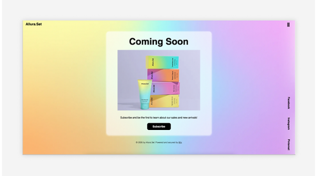
Take a look at the coming soon landing page template provided below. When visitors click on one of the promotional links and go here, they’ll see a clean, simple header. The logo and a small hamburger menu (both of which can connect to your homepage) can both fit in the header’s translucent space. If the header has no distracting links or CTAs, the user’s focus will be brought directly to the article’s body.
4. Restricted Navigation
It’s fantastic to have a catchy title and unique selling proposition. However, if people keep browsing and move away from your page without converting, all your hard work was for nothing. Hence, it is always better to have landing pages with a limited or absent navigation menu.
In such a scenario, users only have the following options:
- Continue reading
- Convert into customers
- Close the window or tab
With that in mind, you should get rid of any links that could cause people to leave your landing page.
5. The Hero Shot
In the realm of landing pages, where visitors typically have a very short attention span, the cliché “a picture is worth a thousand words” rings especially true. It’s important to have a high-quality hero shot that accurately depicts your offer so that your visitors can get a feel of it.
Think about what you’re selling before you leap headfirst into the euphoric world of stock photographs. When people see your product or service, what do they think?
The goal is to encourage customers to imagine how they might put your product to use. Take this example from Love Child Organics, a manufacturer of organic baby food:
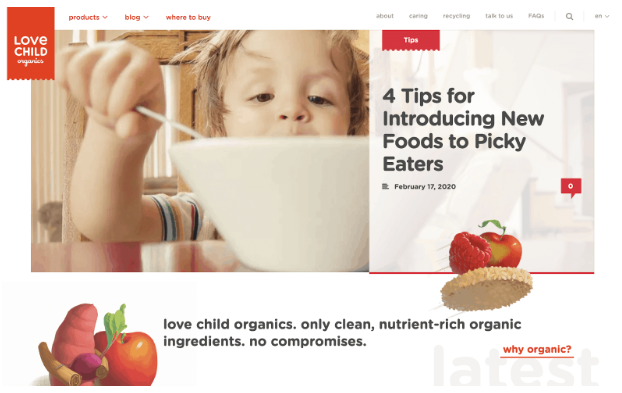
This landing page (created by Banan) could have used a picture of a happy, tech-savvy parent. Instead, they start catering to the finicky eaters who actually buy their products. No aeroplanes or “choo-choos” are necessary to deliver a healthy dinner. Wish that was your baby, right?
6. Advantages of the Product or Service
We have discussed how headlines, unique selling propositions, and images all play a role in the overall design of your landing page. While they do a great job of enticing readers to keep going, they don’t answer every possible question that could come up.
This is why you need a benefits/features section on your page:
You need to convey the benefits of your goods and services on your landing page. Yet, while introducing them, it is best to position them as advantages so that people can see the positive effects they will have on their lives.
Features explain what your product can do, while benefits spell out the advantages it offers. As such, place yourself in the customer’s shoes. Then ask this question to yourself- How does it benefit me?
Think of a compelling approach to showcase your advantages once you’ve laid them out. It’s simple to get sidetracked if you opt for the long-form method with a wall of content.
Instead, highlight your advantages in brief summaries or bullet points that readers can quickly scan and retain.
7. Keep Repeating the Same CTA
A landing page, in contrast to a website, includes only one Call To Action, which may be to subscribe to the blog, fill out a contact form, or make a purchase. You can try visiting the landing pages of some of the most well-known businesses to see how this works to their advantage.
Landing pages are created by brands with the goal of generating conversions. Users are more likely to subscribe, make a purchase, or fill out a form if you only give them one thing to do before they leave your site.
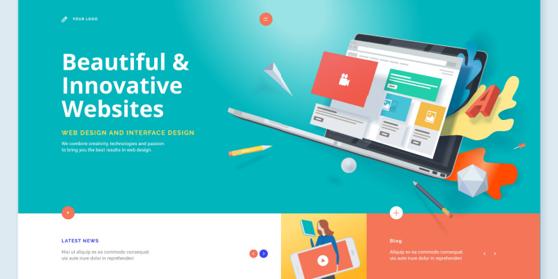
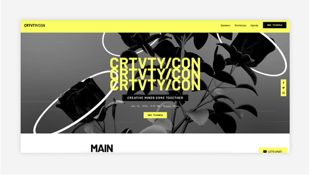
It’s essential to have the call to action button show up multiple times. For instance, the “Buy Tickets” Call To Action appears multiple times in the landing page template below.
Final Thoughts
Apart from the above elements, you may have tons of other innovations to boost your landing page’s appeal. However, you must keep in mind that a landing page’s primary purpose is to increase the number of people opting for the advertised offer. And well, at Digital SEO- the foremost web design company in Chennai, we have the expertise to ensure your landing page delivers the best results. Get in touch with us today to know how.
Latest posts by Digitalseo Team (see all)
- Landing Pages for Mobile – An Optimization Guide - March 18, 2024
- Maximizing Core Web Vitals with Effective Image Optimization Techniques - March 1, 2024
- Secure Your WordPress Site: Vital Security Enhancement Tactics - January 3, 2024